Exploring the Pantone Colour(s) of the Year 2021 with tiles
The Pantone Colour(s) of the year 2021 is actually 2 shades, PANTONE 17-5104 Ultimate Gray and PANTONE 13-0647 Illuminating. These two colours speak to a combination of looking back on 2020, a year that was difficult for many, and looking forward with hope and optimism in 2021.
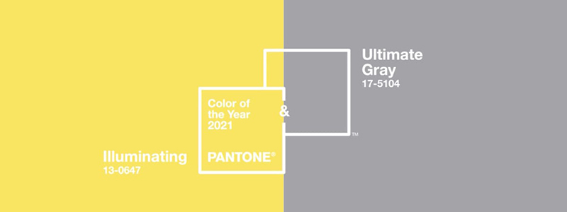
Pantone describe their choice as “a marriage of colour conveying a message of strength and hopefulness that is both enduring and uplifting.” Ultimate Gray represents practicality and a dependable foundation on which to build for the future, whilst Illuminating sparkles with solar energy and warmth. In design terms, the combination of a neutral palette emboldened by a feature colour is a time-honoured one, dependable and resolute. In interior design, the combination of this steadfast shade of grey with the sunny yellow of positivity conveys optimism and hope.
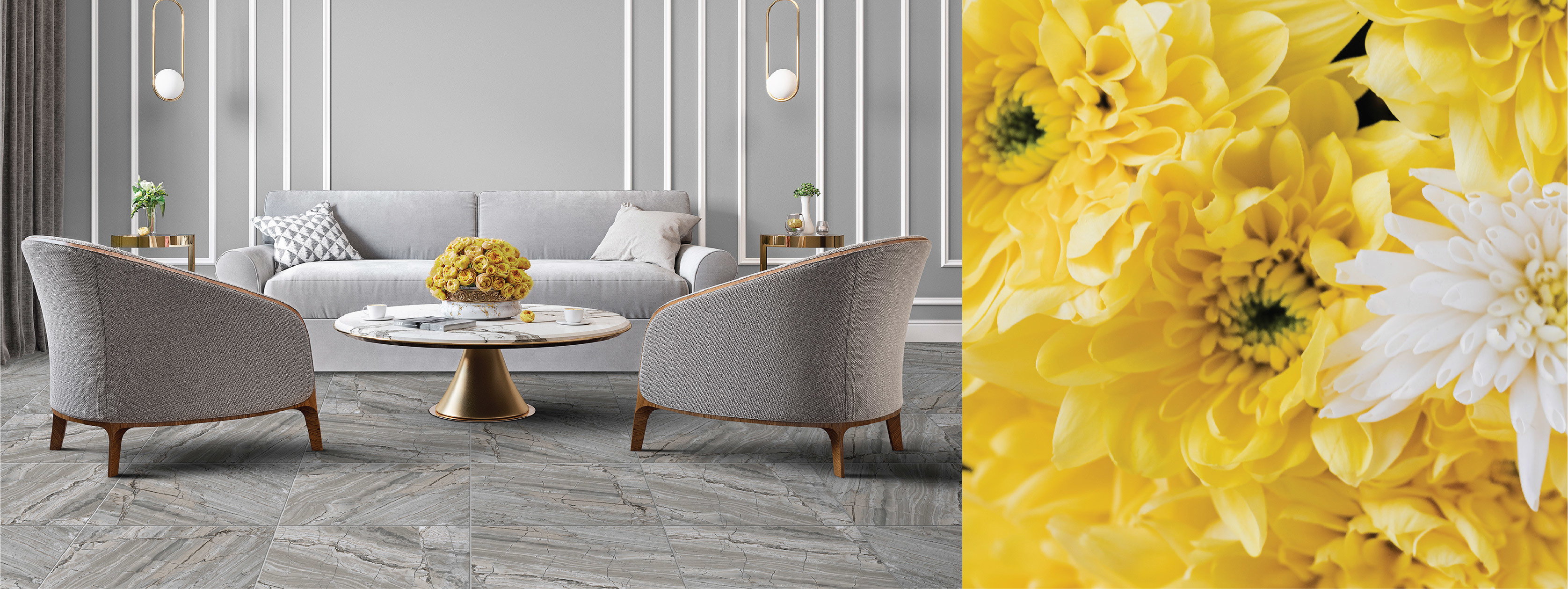
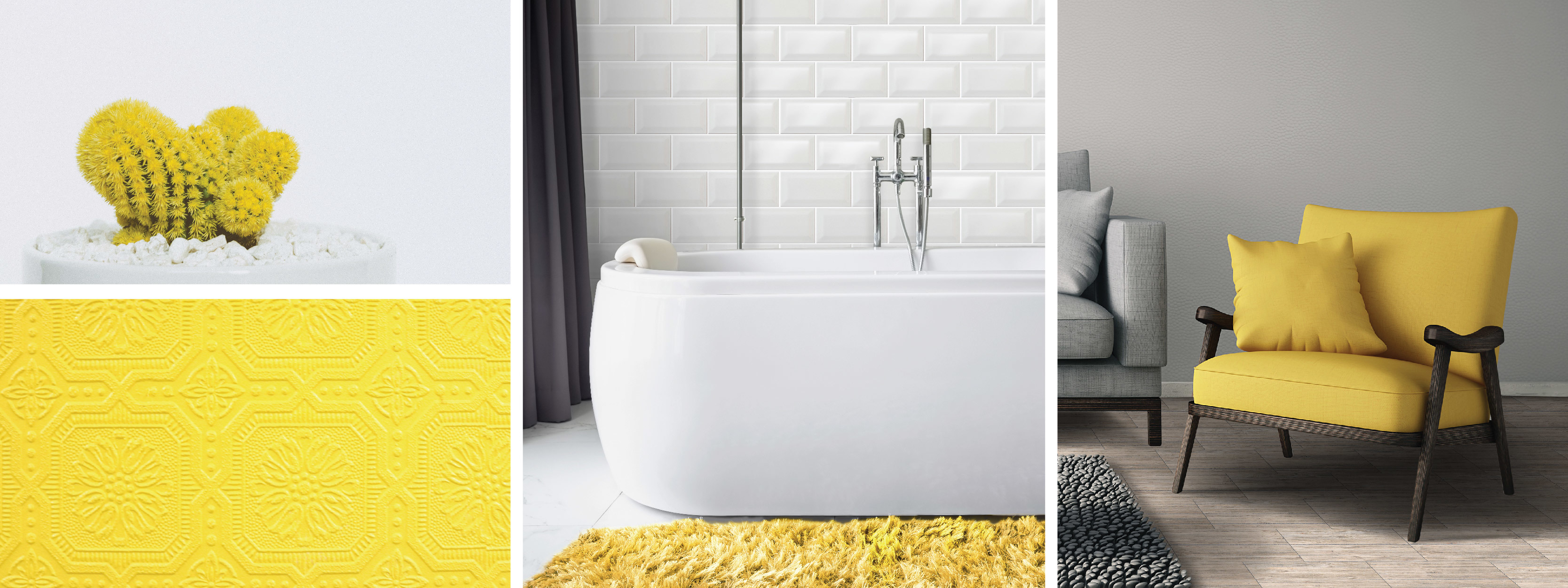
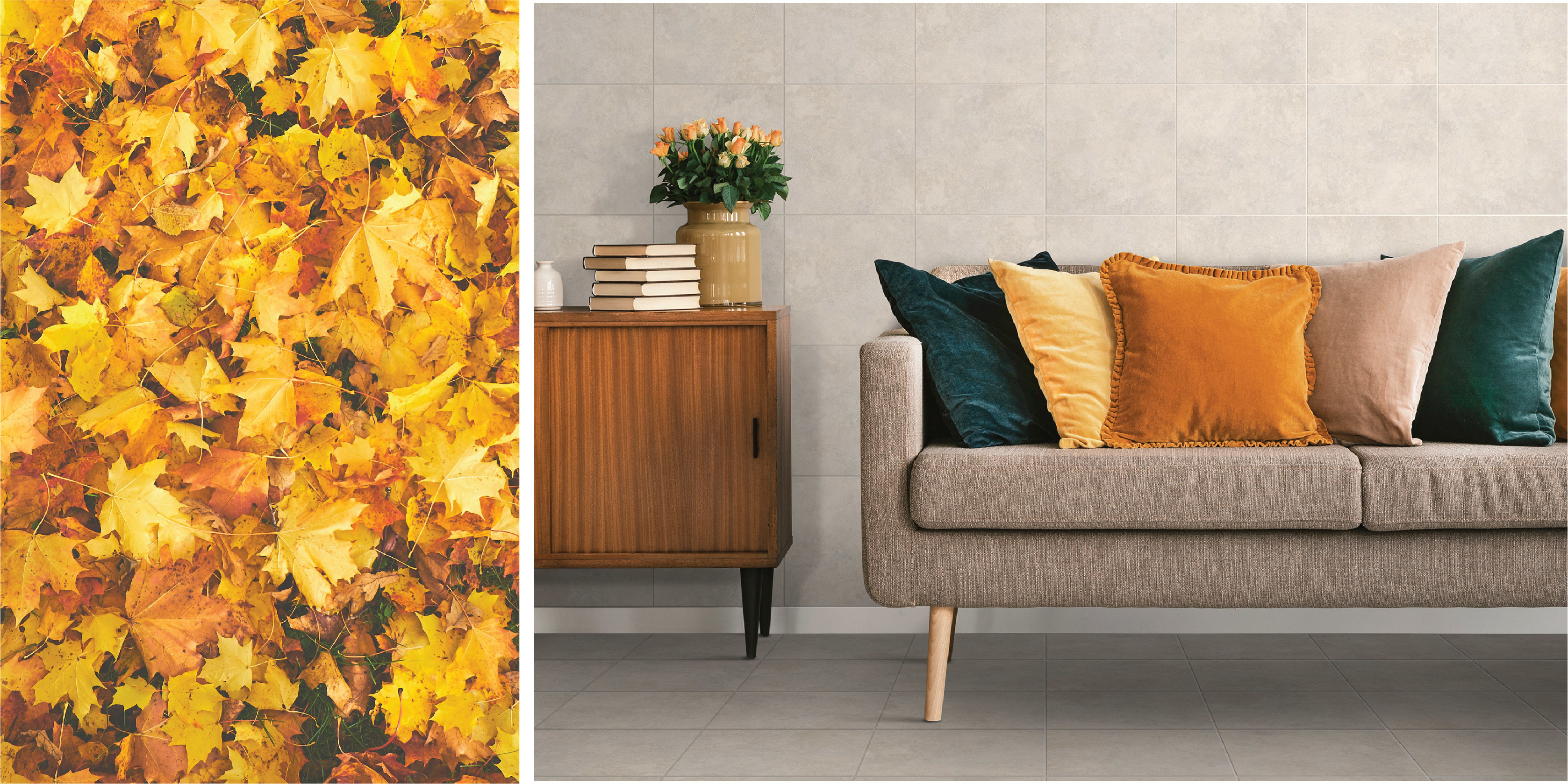
Our recommendation for pairing Ultimate Gray and Illuminating in your space is to start with a foundation of grey wall or floor tiles in a monochromatic palette.
Atterbury Pearl ab 995 | Brushed Cement charcoal bm 850 | Barista red velvet encaustic bs 937
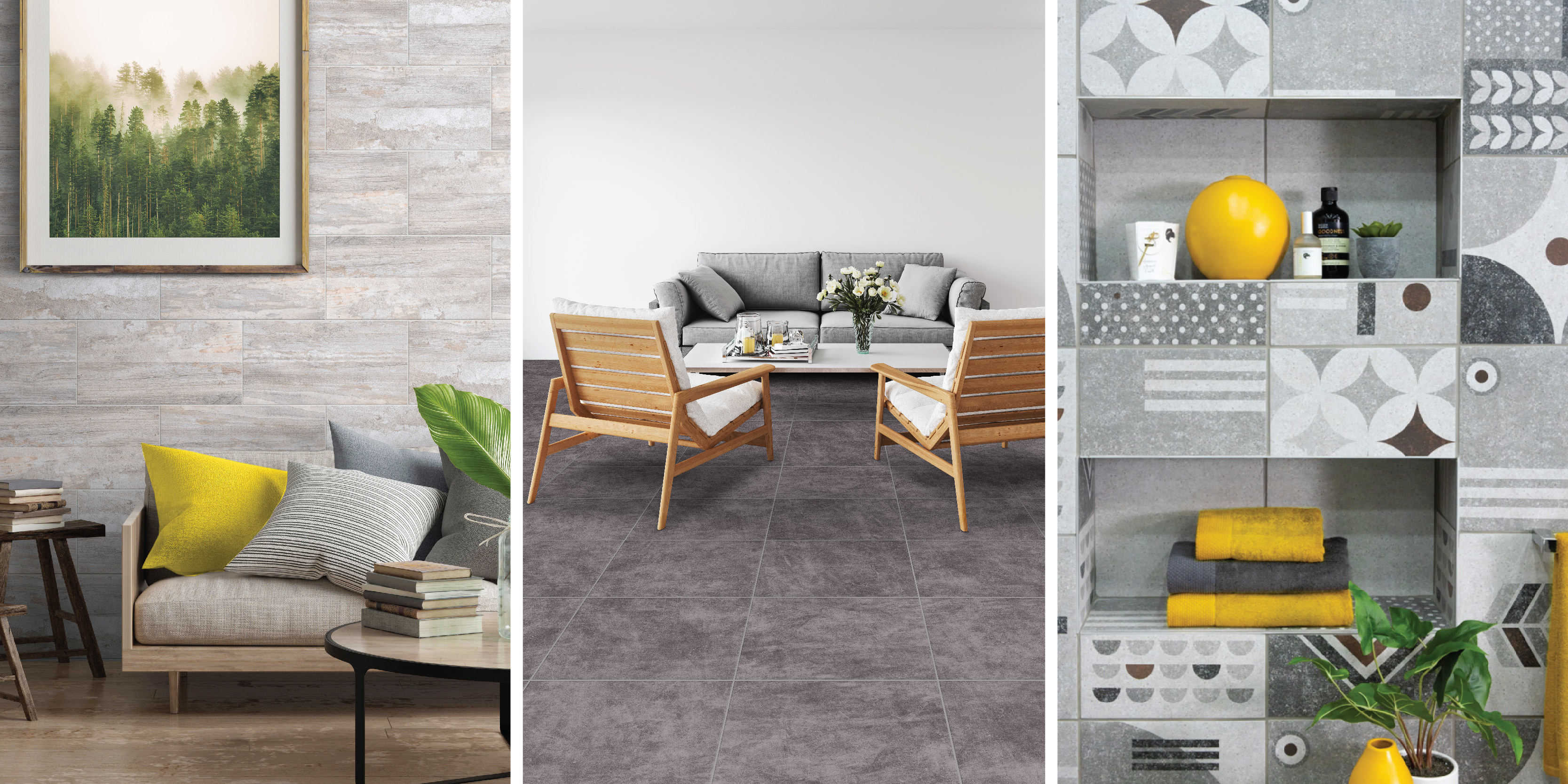
Modern tile manufacturing allows for a wide range of options to consider, from the weathered tones of driftwood to the industrial greys of cement-look designs, from a stone-look finish to traditional encaustic patterns. Choosing the shade and pattern which suits your design aesthetic best, whilst giving a nod to the Pantone Ultimate Gray, melds your own style with current trends in a very personal and authentic way.
Metro white | Decking Ash dk 524
Build on this foundation by pairing Pantone’s Illuminating through the soft furnishings, wall paint, or a bunch of cheerful yellow flowers to truly embody the optimism and warmth of this colour combination. The bright colour will support the timeless appeal of the neutral grey foundation, whilst bringing lightness to the overall effect.
If grey isn’t suitable as your grounding colour within the space, use a neutral tone such a greige or bone as the foundation for the room, layering in the warmer autumnal shades of yellow for a more muted interpretation of the colour trend.
In a fast-paced world, that has been forced to slow down, Pantone’s colour choices for 2021 are a reminder that steadfastness and optimism can work together to produce great spaces that feel safe yet embrace hope for the future.